A former co-worker, Louise Buttler who is a marketing guru, gathered a team of 5 professionals to work on rebranding BeautiControl’s makeup and skincare brands.
The primary goal of the rebrand was to boost sales and improve brand perception. By updating the visuals (logo, packaging) and refining the product lines to better target specific demographics, BeautiControl aimed to:
Create a more modern and appealing image for the brand.
Better differentiate the product lines, making each one feel tailored to its specific audience.
Ensure the packaging and design were competitive with other brands in the market, appealing to both current consumers and new ones.
Logo Redesign
The first step was redesigning the logo to modernize its look and make it more aligned with current design trends, while maintaining brand recognition.
It was created to have a cleaner, more sophisticated aesthetic and modern look. Also to give the brand a fresh and timeless look without alienating existing customers.
Packaging Redesign
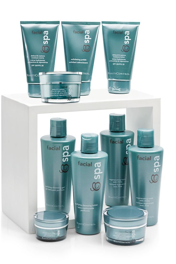
Rebrand Packaging for BC Facial (mass brand for ages 20-30): Packaging was designed to be sleek, vibrant, and modern, appealing to younger consumers. The design was created to be minimalistic yet bold with a contemporary vibe that reflected the latest trends.
Rebrand Packaging for Makeup Line: This packaging overhaul aligned with the new brand image, ensuring all products look cohesive and elevated. The goal was to make the packaging more appealing to consumers but also more functional (e.g., easy-to-open, compact, travel-friendly).
Rebranding the rest of the skin care brands:
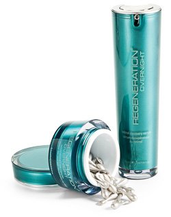
Regeneration (masstige brand for ages 40-50): This was a masstige brand, so the design needed to feel sophisticated but yet affordable. Packaging was white and had a satin finish to create a luxurious feel while staying accessible. If the packaging permitted a little bit of silver hot stamp was added. A color accent was added to the graphics in order to differentiate the packaging by skin types.
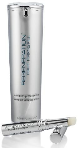
Regeneration Platinum (premium line for ages 50-60): For this prestige line, packaging was more high-end, so I incorporated elements like glossy finishes, heavier materials (e.g., glass, premium plastic), and unique components if possible to evoke luxury and quality. To elevate the look and feel, all the components were silver with a satin finish.
Skinlogics (for all ages): This mass-market line had a simpler and yet modern look to feel fresher, with a clean and polished aesthetic. No embellishments were added but different colors were included in the graphics to differentiate the packaging by skin types.